Tuesday, April 5, 2011

Underpainting Example : The Lone Building

Below is the building I quickly sketched and provided an in-class example of an underpainting:


Here is the matte medium example I was doing speedily for Rachel:

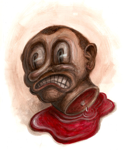
Dead Head

Monday, April 4, 2011

Underpainting Example : Fat Squirrel in the City

In class I will show how to add light layers of paint mixed with matte medium, paint mixed with retarder, and opaque paint to this underpainting:

Thursday, March 10, 2011

PROJECT 3: INVISIBLE CITY

The great modern fabulist, Italo Calvino, released Invisible Cities in 1972. The book’s framing story involves Marco Polo describing to Kublai Khan the cities in the Khan’s empire (the empire having grown too large for the Khan to visit them all himself). The cities are described in series of prose poems, and often less about describing urban geography than exploring philosophical or poetic notions, such as human nature, linguistics, metaphysics, ethics, and memory. We will create images based on some of Calvino’s Invisible Cities. This illustration will be proportional to 11”x15”.

OBJECTIVES

To adapt a visual image from a literary source that uses non-literal and poetic imagery; to expand upon source material in order to have greater insight into its depiction; to fuse disparate historical sources to create a credible non-existent environment; to contrast interior and exterior space using separate warm and cool palates.

PROCEDURE

Read the packet excerpted from Invisible Cities, and choose the city you would like to illustrate.

“Day in the Life:” Write 300-500 words about a typical day in the life of an inhabitant of your city. Begin in the morning, and record the inhabitant’s routine until he or she goes to sleep at night. Look to your own daily routine for events to transpose upon your inhabitant.

RESEARCH: Research the cities of two different cultures. Each culture should be separated both geographically and by at least 200 years in time. Find images from both of your selected cities for each of the following:

  • 5 building exteriors, including personal dwellings and a religious center
  • 5 building interiors
  • 3 forms of transportation; public art
  • furniture, including chairs, beds, tables, and storage
  • clothes for men, women, and children. The more images you collect, the more inspiration you’ll have when designing your city.

CONCEPT ART: Design the following for your city:

  • 3 building exteriors, including personal dwellings and a religious center
  • 2 building interiors
  • 3 forms of transportation
  • public art
  • furniture, including chairs, beds, tables, and storage
  • clothes for men, women, and children

Consider what you know about your city both from Italo Calvino and your own writing. Remember that people have lived in this city for generations: their will be older and newer styles jostling against one another; there will be inhabitants who prefer more conservative styles, and inhabitants who are more progressive. There will be noise, and garbage, and graffiti. It should look lived in.

SKETCHING: Develop 30 thumbnails of a scene in your city. The scene should show both an interior and exterior space, and should contain enough specific action that it looks like a scene taking place in your city, not just a study of the city itself. You may want to return to your “Day in the Life” piece and depict some of the actions described there. Choose the best two
thumbnails and draw them larger and cleaner as presentation sketches for class. The “Day in the Life” piece, the visual research, concept sketches, thumbnails, and presentation sketches are all due 3/24.

DRAWING: Based on the feedback you receive in class, refine your sketches into a full-size drawing, 11”x17”.

COLOR COMPOSITIONS: The color scheme for this project is a warm/cool split. Paint the interior of your scene mixing only cool versions of the colors on your palette together, and paint the exterior using only warm colors (or vice versa). When you are satisfied with your drawing, execute three color studies to determine the most effective way to use this particular color scheme.

PAINTING STAGE ONE: Using a neutral color (not black) that will blend well with your color scheme, paint in the values for your painting. You may also use white paint to re-establish lighter values.

PAINTING STAGE TWO: When the value scheme has been satisfactorily established, begin to lay in the colors with transparent layers of acrylic paint. Do not use white paint at this stage. Build rich, deep shadows with many transparent layers.

PAINTING STAGE THREE: When the color scheme has been established for the painting, you may adjust any final details with opaque paint. When used as highlights, opaque colors contrast well with transparent shadows

3/10 Mid-Term.
Project 3: Invisible Cities assigned.
In Class: Exercise 5: Color Textures

3/14
Spring Break.
3/17
Spring Break.
3/22
Project 2: Periodic Table due.
In Class: Work on Project 3 thumbnails

3/24
Project 3: Invisible Cities thumbnails, written and visual research due.
In Class: Begin drawing.

3/29
In Class: Exercise 6: Color Studies.

3/31
Project 3: Invisible Cities drawing due.
In Class: Paint Invisible Cities.

4/4
In Class: Paint Invisible Cities.

4/7
In Class: Zoo Studies.
4/12
Project 3: Invisible Cities critiqued.
4/12
In Class: finish Project 3 Invisible Cities
4/14
Project 4: animal tale assigned.
4/19
Project 3: Invisible Cities turned in, flapped and labeled.


SOME INSPIRATION:
http://www.rot13.org/~dpavlin/bladerunner/design.htm
http://www.fengzhudesign.com/gallery.html
The Production DVDs for The Lord of the Rings

Tuesday, February 15, 2011

PROJECT 2: PERIODIC TABLE

Periodic Table Reference:
Color Charts & References:


An element is a chemically pure substance consisting of a single type of atom, such as
oxygen, lead, or uranium. In 1869, the elements were organized according to their
chemical properties and atomic number by Dmitri Mendeleev. This chart is called The
Periodic Table, and has, with refinements, been in use ever since. For this assignment, we
will create an illustrated Periodic Table. The illustration will be 12”x12”.

OBJECTIVES

To use research and ideation techniques to develop narrative from a non-narrative point
of departure; to build upon the compositional, referenced, and painting skills from Project
1; to use a near-complementary color scheme in a painting; to balance multiple formal
demands with the need to create a striking image.

PROCEDURE

Chose a chemical element, and sign up for it on the posted Periodic Table. Only one
person may pick a given element.

Research your element, making note of at least ten distinct facts about it. These may be
from the history or folklore relating to the element, interesting physical properties, or uses
and applications. To this list of ten you may add any personal associations you may have
with this substance. From this list, develop a mind map, spinning out associations from
these facts, and then building on those associations. When you have developed a rich
map of associations, look for connections between concepts from different branches of
the map. Make note on the map of interesting visual and narrative ideas that come out of
these connections.

Ideally, you are seeking two things: a basic narrative to depict in your illustration, and at
least one other thematic reference to the element. Take antimony as an example. This
metalloid substance, which I’d never heard of until seeking out an obscure element to use
as an example, doesn’t seem very promising, at first. It’s shiny, in a chintzy sort of way, and
has a number of industrial uses: it’s used in plumbing, and matches, and flame-proofing
compounds. But then I find out that it was used make kohl, the dark eye makeup favored
throughout the Ancient World. Now, all sorts of narrative possibilities open up: Cleopatra
being made-up before meeting Caesar; Salome dancing for the head of John the Baptist,
even Johnny Depp dressing up as Jack Sparrow. Pretty much any scene from history or
myth that involved a man or woman wearing eye make-up is fair game. Drawing
connections between Cleopatra’s Egypt and antimony’s use in matches and
flame-proofing leads me to Sekhmet, the Goddess of Fire. So, Cleopatra being made-up
with kohl before meeting Caesar is my main narrative for my illustration, and images of
Sekhmet (as well as some compositionally prominent braziers) addresses my secondary
thematic reference to antimony.

In addition to the narrative content and at least one secondary reference, the illustration should include the atomic number of the element being depicted (in the case of antimony, this is 51).

SKETCHING: Develop25 thumbnail sketches of your idea. Each thumbnail should be a
different compositional approach to the image. Select the three best compositions and
draw them larger (around 4”x4’) and neater, so that you can present them to the class.

PHOTO-REFERENCE: Collect the friends and props necessary to shoot good references
for your illustration. As with Tableau Vivant, use the photo-shoot as an opportunity to
explore and refine your composition. Bring at least ten good shots to present to the class.
Additionally, collect any other photo-references you will need for your image.

DRAWING: Based on the feedback you receive in class on your photographed
compositions, develop your drawing at the size of the final illustration. Determine each
figure on separate layers of tracing paper, as well as the background, and any major props.
Manipulate the layers of tracing paper around to tweak your drawing. When you are
satisfied with the composition, transfer it to illustration board.

PAINTING: This image will be rendered in a near-complementary color scheme. Using a
color wheel, determine the palette of your piece. You may use only these two colors,
black, and white. Spend some time in your sketchbook making some color swatches with
these paints: the 2 near-complementary colors, at least three neutral tones created by
mixing them in different proportions, and then tints (the color mixed with white), shades
(the color mixed with black) and tones (the color mixed with grey) of all 5 colors. This is
a very limited palette, but it can be very effective when considered carefully, and used
strategically.

PRESENTATION: When the painting is finished, flap the illustration board with a sheet of
tracing paper and a sheet of cover stock.

2/15
Project 1: Tableau Vivant critiqued.
Project 2: Periodic Table element chosen.
2/17
Project 2: Work on Periodic Table thumbnails
2/22

Project 2: Periodic Table thumbnails and written research due.

2/24
Project 2: Periodic Table research and photos due .
Illustrator Research due.
In Class: begin drawing.
3/1
Project 2: In Class work on Periodic Table drawing
3/3
Project 2: Periodic Table drawing due
3/8
Project 2: Periodic Table critiqued.
3/10
Mid-Term.
Project 3: Invisible Cities assigned.
In Class: Exercise 5: Color Textures
3/14
Spring Break.
3/17
Spring Break.
3/22
Project 2: Periodic Table due.
In Class: Work on Project 3 thumbnails

Thursday, January 27, 2011

EXERCISE 2: EXPRESSION STUDIES

Mark out twelve roughly head-shaped ovals in your sketchbook, about 3” tall. Using a
round brush, create monochromatic studies of the following expressions, as observed
either in a mirror or a willing model:
  • Happy
  • Relaxed
  • Sleepy
  • Confused
  • Frightened
  • Proud
  • Angry
  • Resentful
  • Enamored
  • Nervous
  • Sneaky
  • Over-caffeinated

Materials
  • Sketchbook
  • Hand mirror
  • Medium-to-small round brush

Acrylic paint:
  • Titanium White
  • Dark Blue, such as Ultramarine